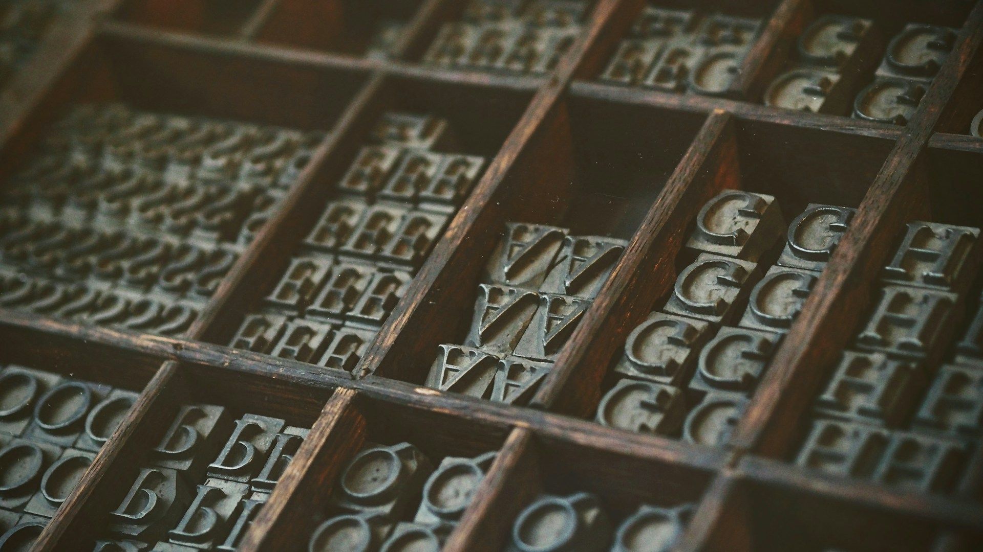
The Subtle Power of Typography
Typography is more than just the selection of fonts, it’s the deliberate arrangement of text to make written language not only readable but also visually appealing and emotionally engaging. When used thoughtfully, typography becomes a powerful tool that communicates the tone, style, and personality of a brand. A well-chosen font can speak volumes without saying a word, while poor typography can undermine even the best of messages.
Take Coca-Cola’s Spencerian Script for example. A typeface that evokes feelings of warmth, joy, and the timeless quality of one of the worlds most recognised brands.
Compare that to Gap, who in 2010, attempted to redesign its classic logo, replacing the iconic blue box and serif font with a minimalist Grotesk one. The new design was intended to modernise the brand but ended up feeling generic, bland, and corporate, lacking character.
The Overlooked Impact of Typography
It’s Invisible When It’s Good
When done well, typography should feel seamless and natural. You don’t think about the structure of a typeface when reading a well-designed magazine or a clean, easy-to-navigate website. It’s only when typography is poorly executed too small, cramped, or difficult to read that it becomes painfully apparent.
Typography and Brand Identity
Typography is a critical pillar of brand identity. It helps set the tone, reflects the brand’s voice & mood, and gives visual coherence to all forms of communication. For instance: Serif fonts convey, professionalism, and reliability. Sans-serif fonts are more modern, clean, and accessible, while Script fonts bring elegance, creativity, or a personal touch.
A mismatch here can confuse the audience about what the brand stands for. For example, if a law firm uses a playful, hand-drawn font on its website, it could come across as unprofessional, undermining credibility. Conversely, a children’s toy brand that uses a rigid, formal typeface may seem too serious, alienating its target audience.
Typography in the Digital Age
In the age of digital media, typography plays an even more crucial role. Websites, mobile apps, and social platforms rely heavily on text-based content, making the need for effective typography more important than ever. Digital typography requires extra care to ensure readability across various devices, screen sizes, and resolutions.
A careful balancing act between form and function, poorly chosen fonts or improper typesetting can quickly turn users away from a website, regardless of how the quality of the content or visuals are.
Conclusion
In a world where first impressions matter and attention spans are short, investing in thoughtful, well-executed typography is one of the most effective ways to enhance your brand’s effectiveness. The power of typography should never be underestimated.


