A New Identity For A New Direction
Brand 360 Applications
Perception
Culture
Operations
Fisher German’s brand no longer reflected their scale or shift in business direction. We modernised their identity while protecting 200+ years of heritage, clarifying their story, broadening market appeal, and creating a flexible design system to serve rural, commercial, and urban sectors. The brand became confident and versatile and united internal teams, resonated with new audiences, and positioned Fisher German as a progressive, trusted leader ready for future growth.
Fisher German has grown significantly, expanding to more than 20 service offerings and completing a merger with Matthews & Goodman in 2022, but their brand hadn't kept pace. The existing identity was routinely misread as that of a rural estate agency, underselling the breadth of the business and limiting relevance with commercial and urban audiences. Internally, inconsistency across departments meant teams were telling different versions of the same story. The brand had served them well, but it was no longer a true reflection of who Fisher German had become or where they were heading.
We first started working with Fisher German in 2020 and evolved into a full rebrand when the business recognised its identity was no longer keeping pace with its growth. With more than 20 service offerings, and following the merger with Matthews & Goodman, the brand was often misinterpreted as a rural estate agency, limiting visibility and relevance.
Our Approach
We started from the inside out. Through leadership interviews, open workshops, colleague surveys, and honest one-to-one conversations, we gathered perspectives from across the business, including those who had joined through mergers. All were essential in shaping a brand that felt inclusive and future-ready, not just familiar. A full brand audit ran alongside this, surfacing inconsistencies in how the brand was being applied and exposing the gap between how Fisher German perceived itself and how the outside world saw it.
From this foundation, we developed the strategic framework: defining brand pillars, clarifying service hierarchy, and establishing a distinct tone of voice. Creatively, we explored multiple directions before arriving at an identity that balanced 200 years of heritage with the ambition and versatility the business now needed.
Rollout was treated with the same rigour as the creative work. We supported Fisher German with internal training, brand guidelines, and stakeholder engagement. Marketing strategies were shared openly, colleagues were involved in campaign planning, and brand ambassadors were appointed to keep momentum alive across the business. The goal was simple: every person at Fisher German needed to understand what the brand stood for, and feel proud to stand behind it.
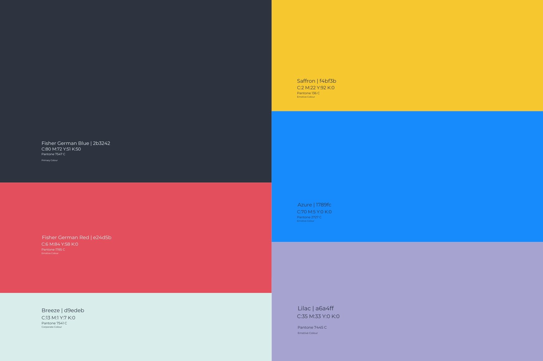
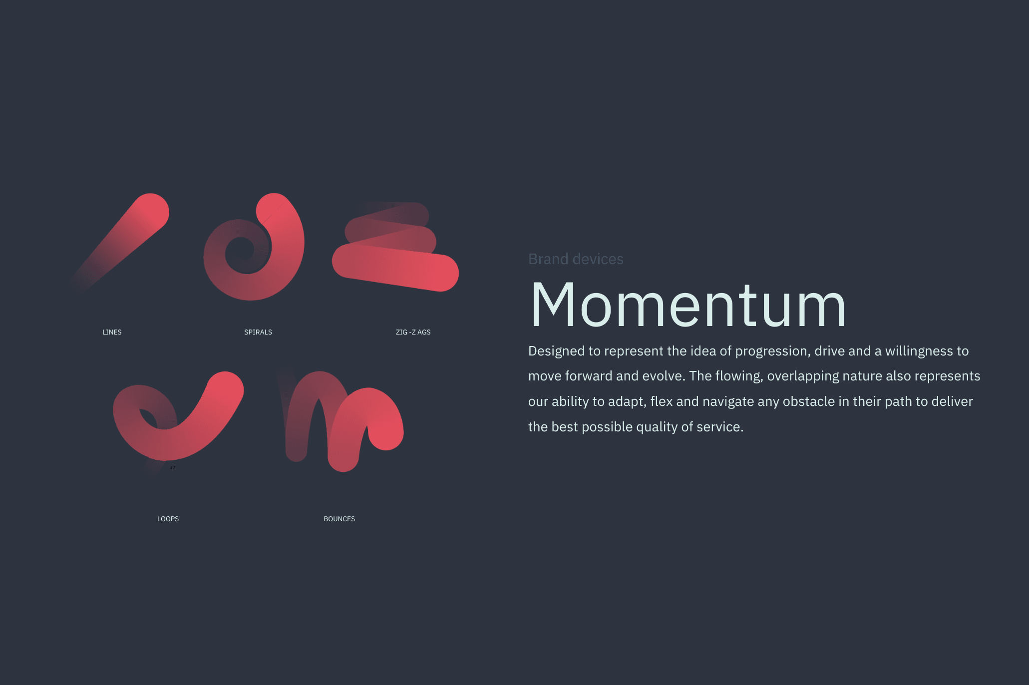
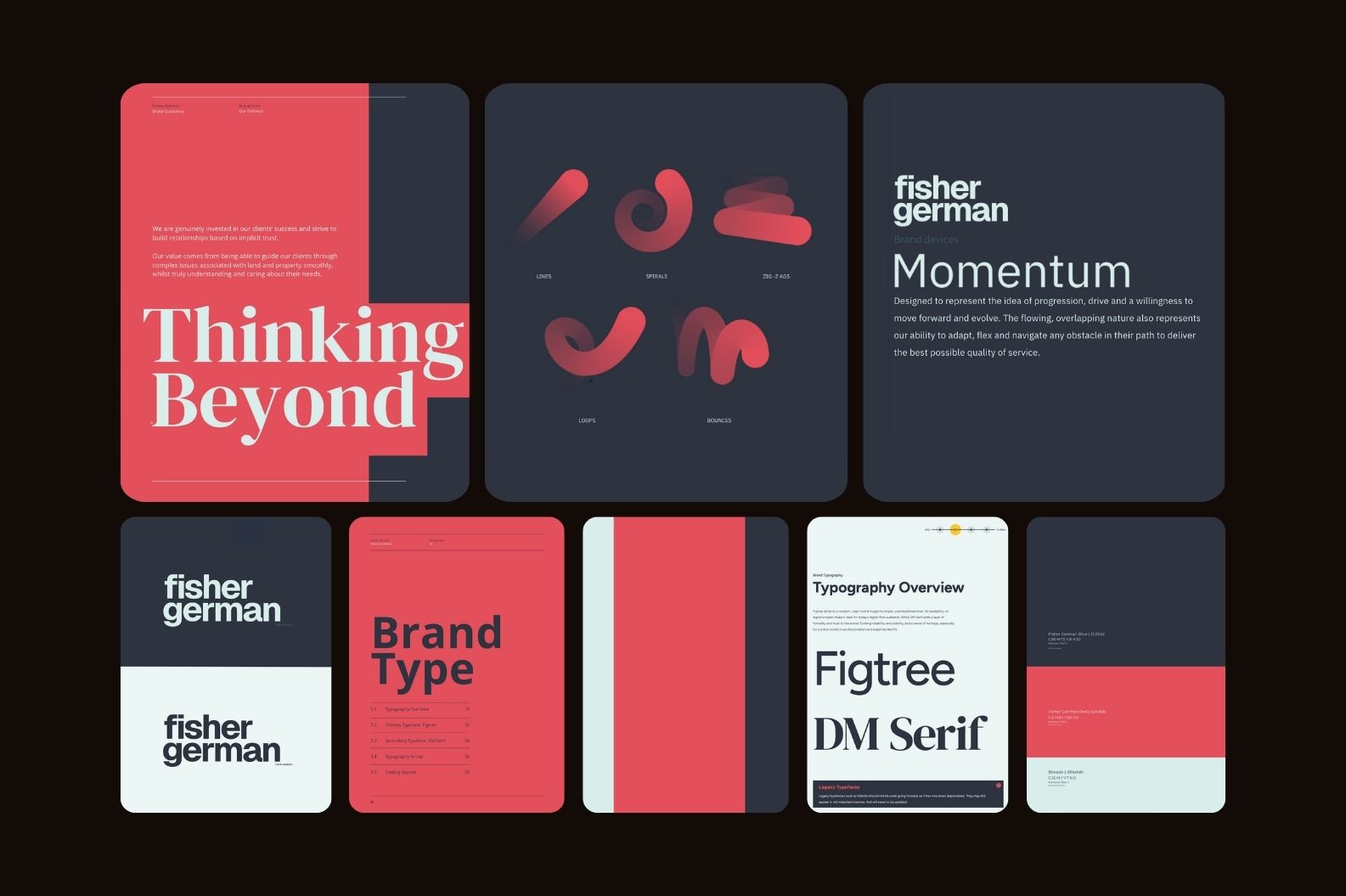
Balancing heritage and modernity
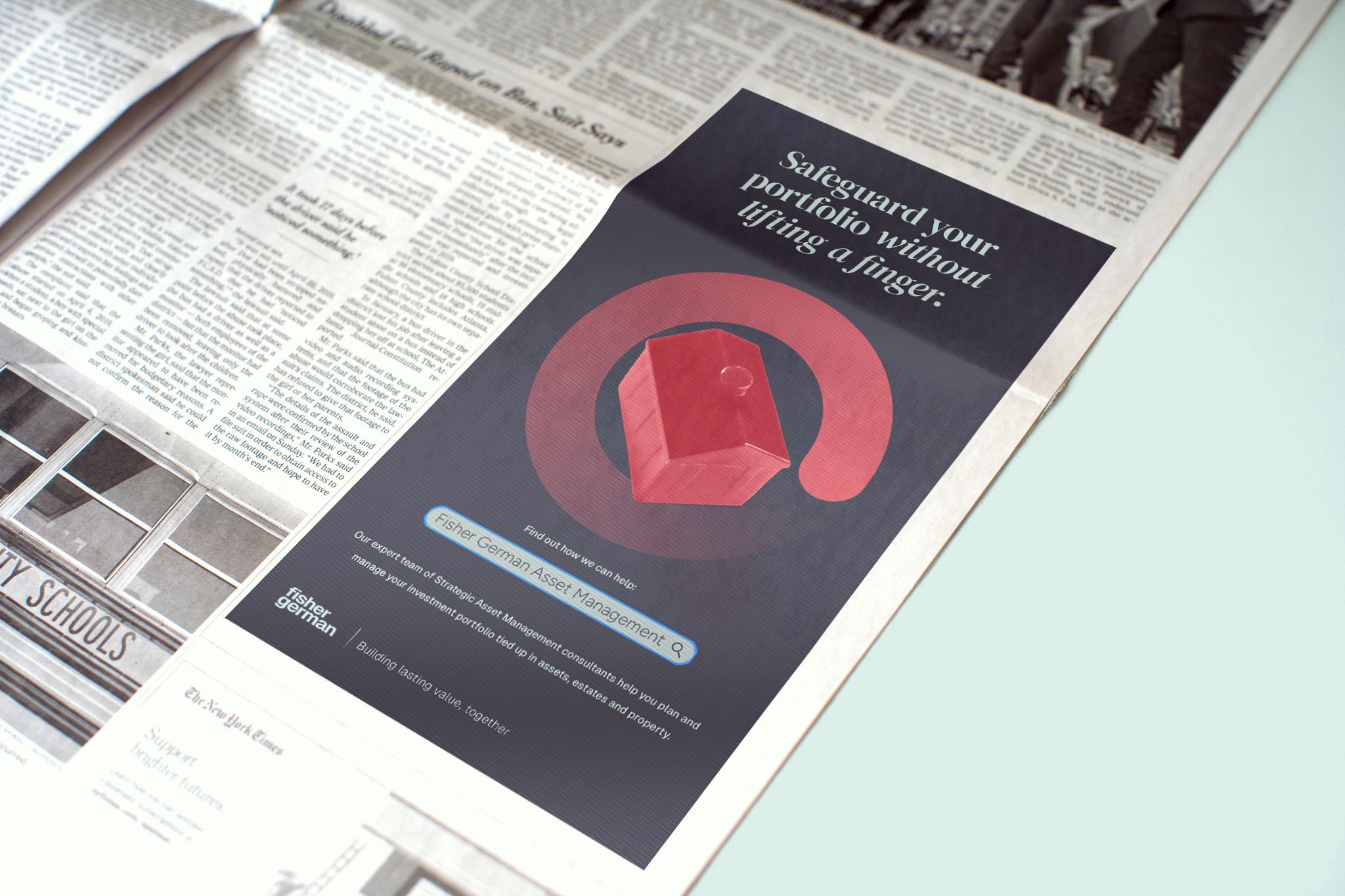
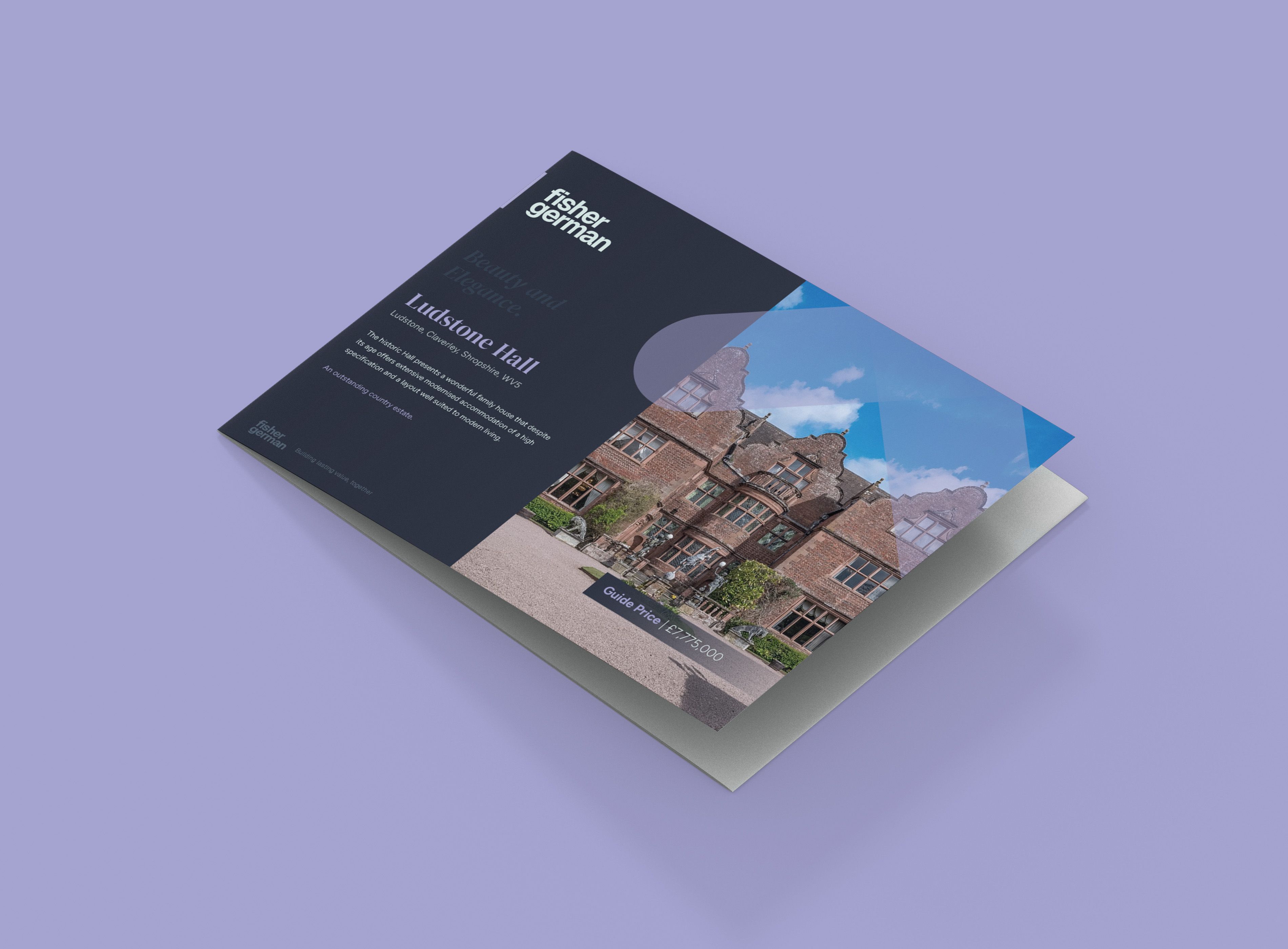
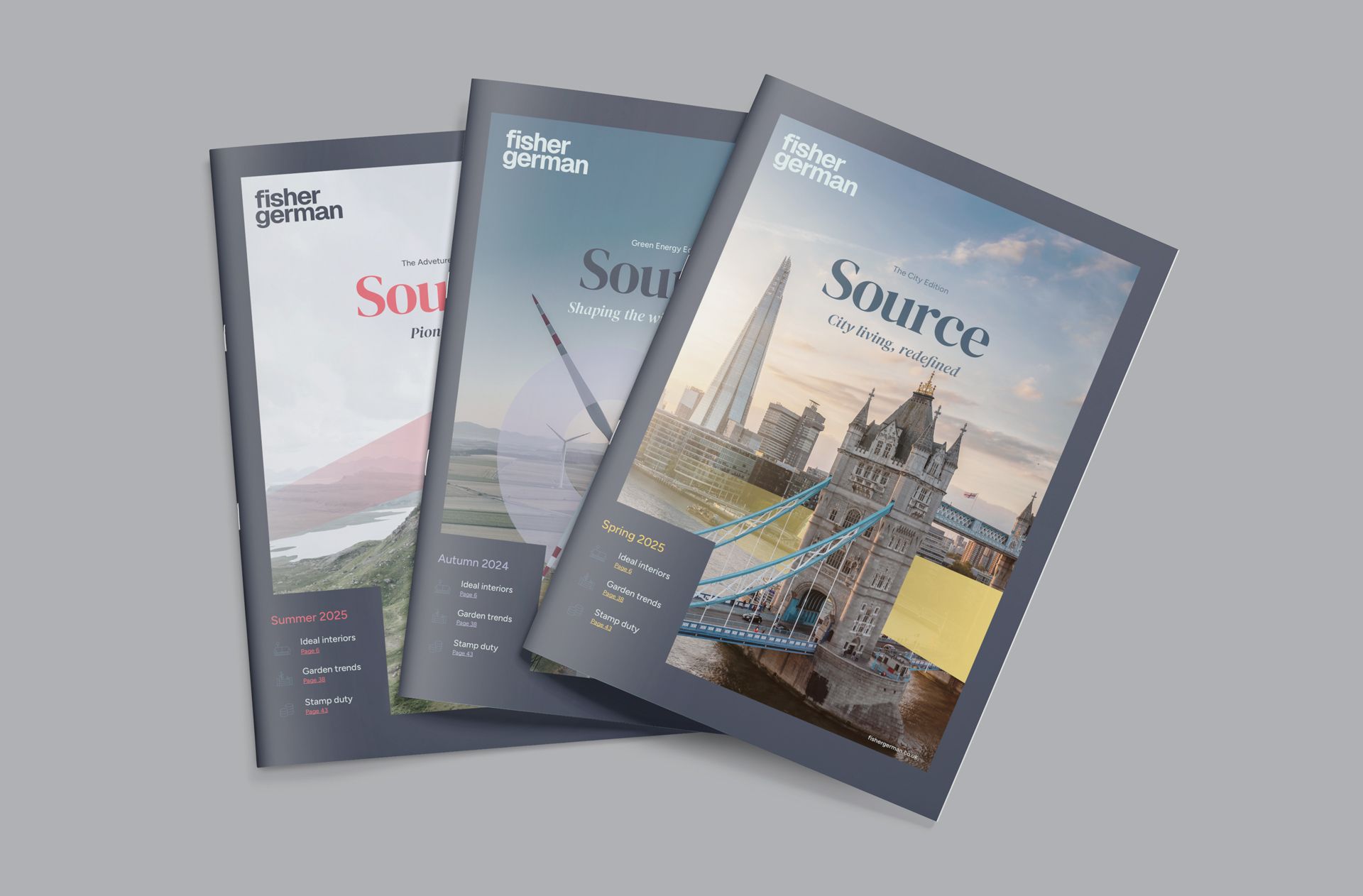
Creatively, we explored multiple directions before refining a brand identity that balanced heritage with modernity. Key changes included a flexible design system, an energised colour palette, a typographic pairing of Figtree and DM Serif, and a decisive shift away from the roundel logo to a lowercase wordmark, reflecting the equity in the Fisher German name and the people-centric nature of the business. A new momentum form symbolises progress, adaptability, and continuous improvement.
The brand workshops were really useful for us. It was a great opportunity to get colleagues outside of the marketing team involved in the direction of the rebrand. The Create Inc. team ran them very well and managed to get everyone involved, even those who didn’t initially seem to want to be engaged. It was a fun session and well timed, without taking too much out of everyone’s working day.
Laura Taylor
Head of Marketing
Brand consistency and rollout
To ensure effective adoption, we supported rollout with internal training, brand guidelines, and stakeholder engagement, embedding consistency across departments and communications.
The Outcome
The new identity captures the breadth of their services, resonates with commercial and urban audiences, and retains subtle cues to their rural heritage. Internally, it created clarity and cohesion, enabling teams to tell a consistent brand story. Externally, it is already strengthening market perception and driving engagement with new clients.
Shift in Brand Sentiment
Within 12 months of the new brand launching, Fisher German saw a 'brand sentiment recovery', recognised by their improvement in positive brand sentiment across digital platforms. They overtook a key competitor in search share, share of voice, and brand sentiment, achieving 9.5 positive mentioned per 1,000 people reached. They also captured market authority in sectors where they had previously held little to no influence.
Thank you so much for your strategic advice, wise counsel and unstinting support. The rebrand launch looks to be very successful…
Stuart Flint
Partner
FAQs.
Every business and therefore rebrand is different, but a project of this scale covering research, strategy, identity and rollout, typically runs over 3-6 months. Our brand sprints cover less research and strategy are designed to be completed in 4 weeks. Every project scope and timeline is bespoke and depends on the needs of each individual business.
A brand refresh less strategic than a rebrand. A refresh will typically update the logo, colours, and typography, and is ideal for businesses who just have a visual issue, rather than one that is strategic or reputational. A rebrand looks at positioning, mission, values, narrative, and visual identity.
We deliberately involve teams early through workshops, surveys and interviews. This way, not only does the brand authentically reflect the business, but it includes people from day one, making them advocates and not bystanders. It is also important to launch the new brand to your people first, before sharing it externally, helping show that its a brand for them, and not just for consumers.
Insight & Industry.
Where we unpack the true value of brand, share practical insights, strategic tools, industry updates, and the occasional unpopular opinion from inside the studio.


Vol 3D