Brand Creation & Product Launch
Brand 360 Applications
Perception
Culture
Operations
We partnered with a new supplement startup to develop a brand ready for launch in a highly competitive health and nutrition market. From naming and brand strategy through to packaging and a conversion-focused website, we built a complete brand system designed to stand out on shelf, build trust, and drive early sales.
The supplements and drinks market is highly saturated, with new brands competing for attention across retail and digital channels. The client needed more than a visual identity. They needed a complete brand that could clearly differentiate them and communicate trust in the lead up to launch.
The challenge was to define a distinctive positioning, develop a compelling brand story, and create packaging and digital touchpoints that would stand out in a crowded wellness category while remaining credible and accessible.
We began with a collaborative brand workshop to define the foundation of the brand. This meant exploring audience needs, category trends, competitor positioning, and opportunities for differentiation.
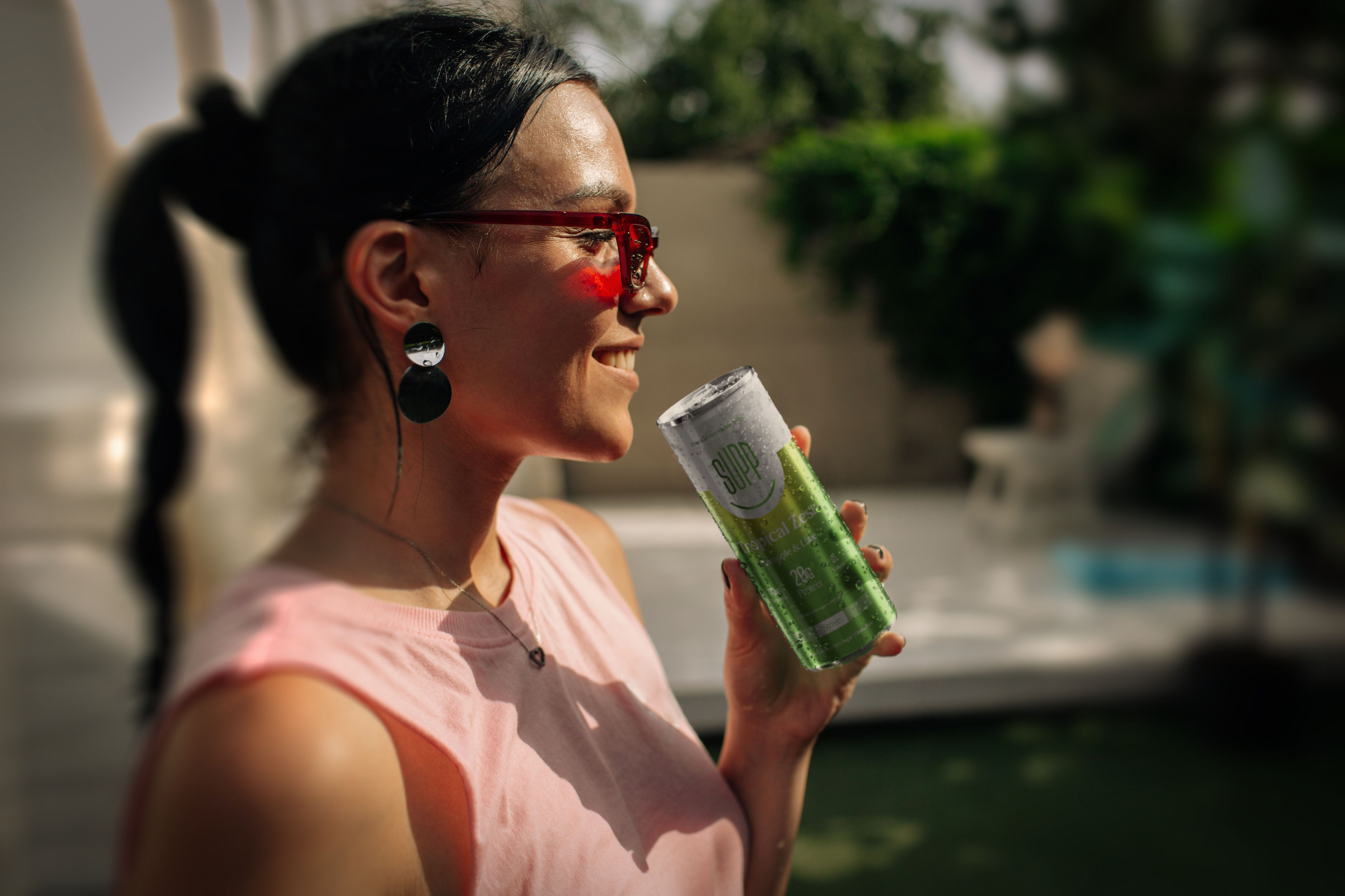
Following extensive market research, we were able to identify a gap across protein supplements. Brands were overwhelmingly targeted at dedicated gym goers and those with a very active lifestyle. They were also primarily targeted at men. We decided that Supp could sell to the overlooked audiences: those who prioritise looking after others before themselves, such as caregivers, parents, and busy professionals who often put their health on the back burner.
From this, we developed a full brand strategy including naming, mission, vision, values, and tone of voice. This provided a clear strategic platform for the creative direction.
We then translated the strategy into a visual identity and packaging system designed to feel bold, human, and accessible. It needed to balance credibility with everyday wellness.
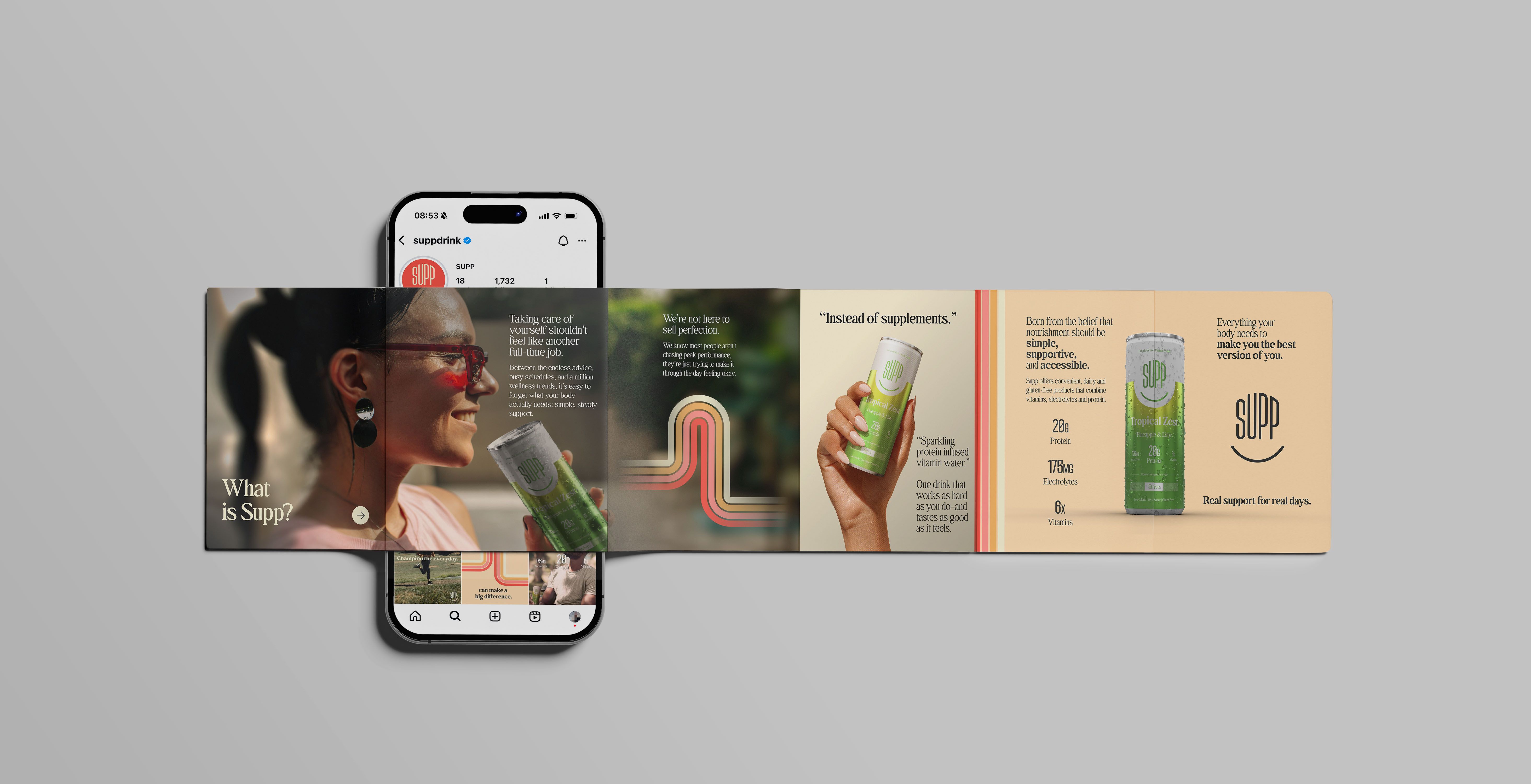
Finally, we extended the brand into a launch website and social content, designed to support early sales and create a consistent digital experience.
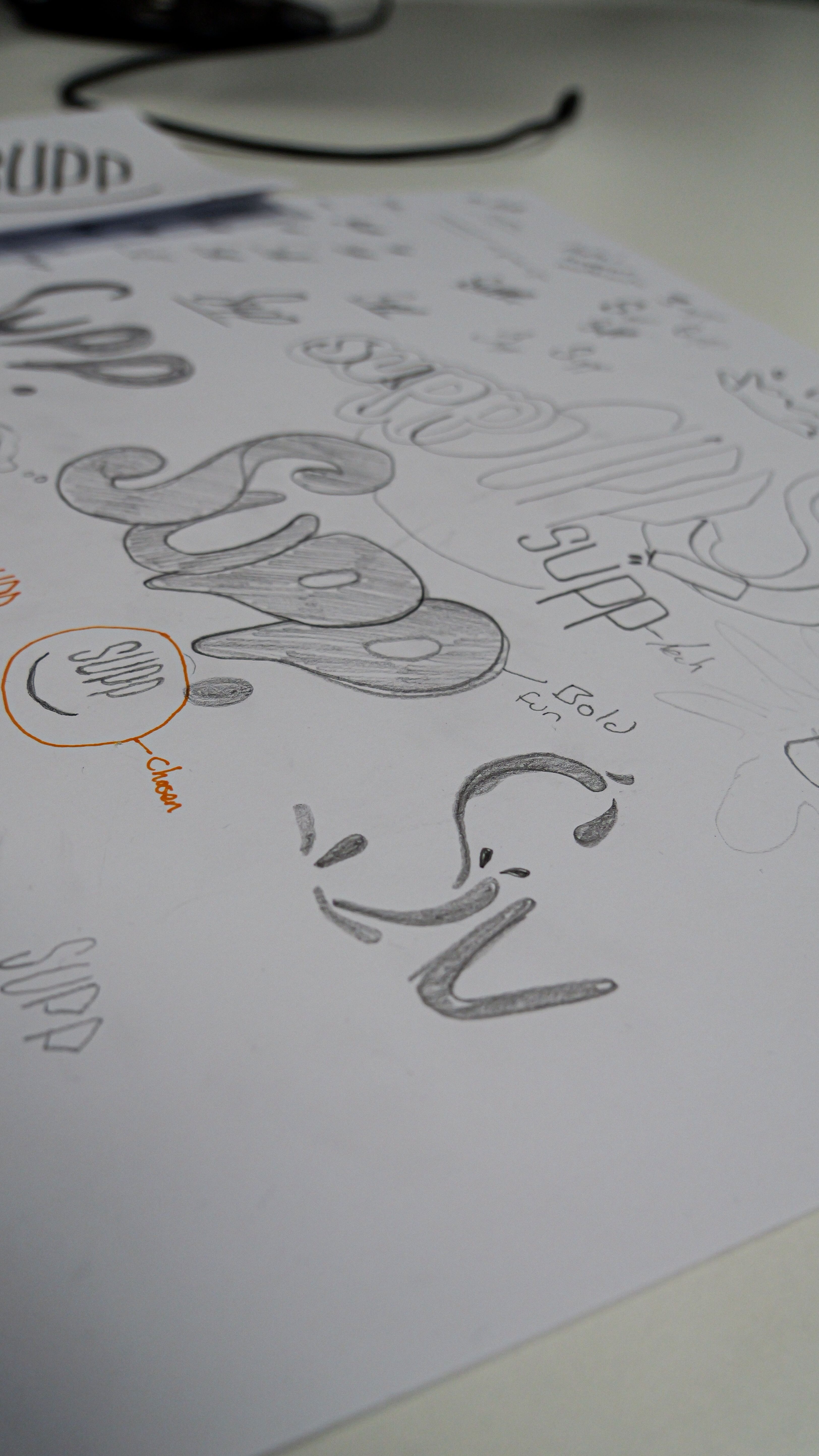
Turning research into design
Building on insights from our research and a collaborative brand workshop with Supp, we explored bold concepts and visual styles that spoke directly to their audience and brought the brand story to life in a distinctive way.

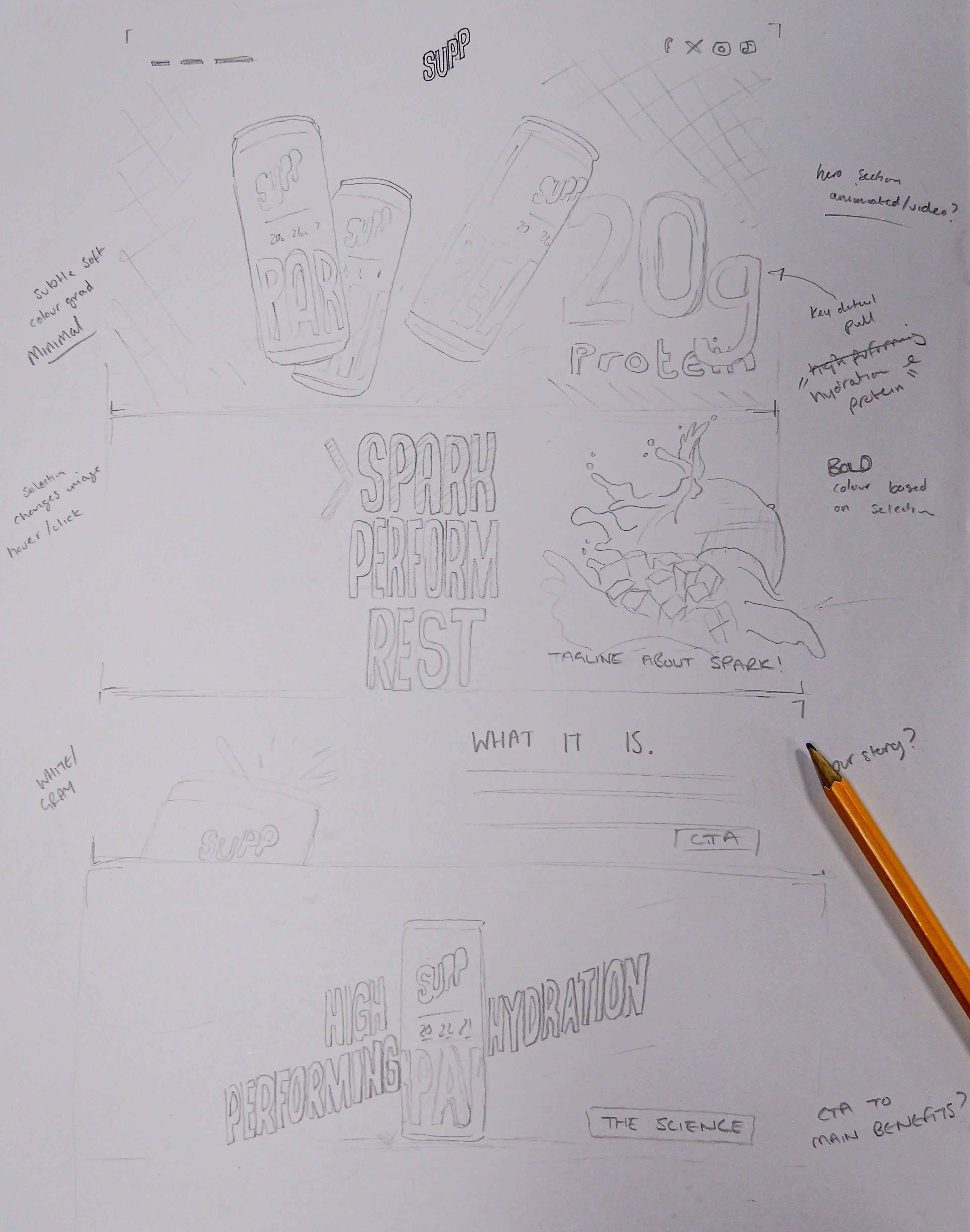
Crafted for users
From wireframes to launch, we reimagined the site around the user with bold visuals, intuitive flow, and a personality that feels unmistakably theirs.

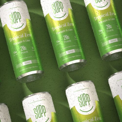
Bringing the brand to life
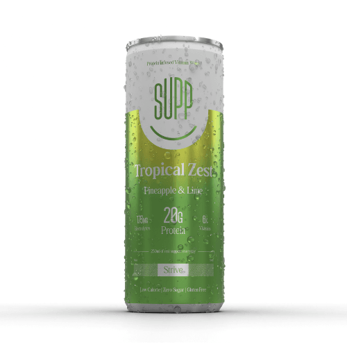
After finalising the visual identity, we brought the brand to life through vibrant can and box packaging that informs, inspires, and evolves easily with future product lines.

Social Outreach
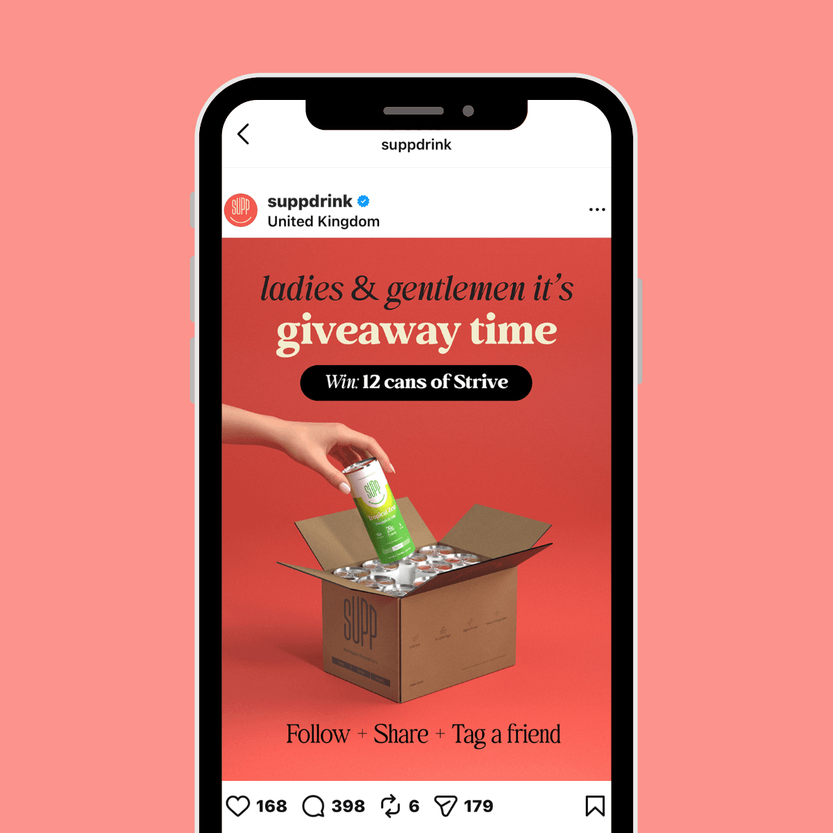
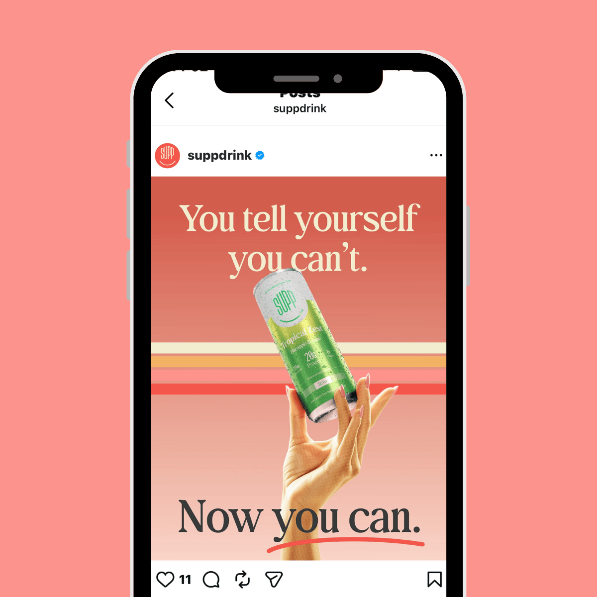
Content was created for Supp's social media accounts to help raise visibility of the new product and drive people to the new website.
FAQs.
Standing out in the supplement market requires a clear point of difference, strong visual identity, and simple, trustworthy messaging. Successful brands balance scientific credibility with approachable design to build trust and drive purchase decisions. For Supp, this meant positioning the brand in a completely different way to other similar products so that it could appeal to untapped audiences. The colour palette was made more feminine and warm with relatable, more authentic imagery.
For DTC (direct-to-consumer) packaging is often the first physical interaction a customer has with a brand, so it plays a key role in shaping perception and trust. It needs to protect the product and it has to communicate value, tell the brand story, and create a memorable unboxing experience. Branded packaging is also more likely to be photographed and remembered.
Insight & Industry.
Where we unpack the true value of brand, share practical insights, strategic tools, industry updates, and the occasional unpopular opinion from inside the studio.


Vol 3D